

OVERVIEW
CCIC Sunnyvale Church Website
The CCIC Sunnyvale website serves as a platform for spiritual communication and information sharing among its members. Additionally, it introduces the church to potential newcomers interested in joining the community.
Client
Church members for worship schedules, sermons, and resources, and new visitors who seeking a local Chinese-speaking Christian community.
Timeline
May 2024 - October 2024, Phase I
My Role
I took a leading role in designing the website, enhancing the user experience, and refining the interface design.
Team Composition
A multi-disciplinary team with a project manage, a web designer, 3 developers and a church elder.
GOAL
Rebuilding the CCIC Sunnyvale Church website aims to create an organized, visually engaging platform that strengthens the church's mission.
By structuring the content clearly, the website will provide easy access to spiritual resources and church information for existing members. At the same time, it will attract new users, offering an inviting digital presence that encourages visitors to learn more and join the community. The site will focus on delivering a seamless user experience, reinforcing the church’s message and fostering deeper connections among believers.
Problems
-
The original website suffers from poor organization, with scattered information that's difficult to navigate, hindering users' ability to find what they need.
-
Its interface cluttered lacks visual appeal, simplicity, and clear structure. The church's mission and unique qualities aren't prominently displayed, leaving new visitors without a clear understanding of what sets the church apart.
-
The church's mission and values are not clearly highlighted making the site fails to communication values and engage the community.
Challenge
This church website embodies the essence of faith and holds significant importance. Elders and coworkers bring diverse perspectives and needs, making it challenging to reach a consensus. As the Lead designer, I have to carefully navigate these varying viewpoints, ensuring the design reflects the church's mission while balancing tradition and modern appeal to resonate with all audiences.
The website requirements can be summarized as follows:
-
Address the diverse needs of various audiences, including current members, new visitors, ministry leaders, and donors, each with unique expectations.
-
Provide content in multiple languages and ensure accessibility for users with disabilities.
-
Highlight the church’s unique values while maintaining authenticity.
-
Strike a balance between tradition and modernity, creating an inviting and welcoming design that appeals to younger audiences and new visitors.
DESIGN PROCESS
The design process had four stages, each addressing specific issues with iterations.
Information Hierarchy
STAGE I
Created a clear, consistent structure aligned with the church's content, optimized the site map for seamless navigation, and defined key pages with cohesive functionality and accessible design standards.
UI/UX Audit
STAGE II
Gathered stakeholder insights and coordinated with developers to establish baseline assessments, along with key design elements such as typography, color schemes, and spacing standards.
Wireframe
STAGE III
Enhanced user flow and ensured seamless page coordination, adapting designs to align with evolving content updates.
Design Iteration, Usability Test & Development
STAGE IV
Iterated on the design to deliver a refined version, conducted accessibility testing, gathered feedback for implementation, and finalized the delivery.
METHODS
Research & Design Baseline


UI/UX Audit
Researched top UI/UX resources for reference and discussed with stakeholders to clearly define the scope and goals of the UI/UX audit.
Competitor Analysis
Evaluated other church websites to gain insights that guide and enhance our design.
Stakeholder Discussion
Collaborated with the team to align content priorities and define design principles that reflect the church’s brand identity.
Design Principles
-
Consistency: Enhances usability and reduces the learning curve for users.
-
Simplicity: Avoid unnecessary complexity to make designs intuitive and easy to use.
-
Accessibility: Create an inclusive user experience.
-
Functionality: Prioritize practical, usable features over unnecessary decorative elements.
-
Scalability and Flexibility: Design systems that can adapt to future growth and changes.
SOLUTION
Design Decisions & Iteration
Information Hierarchy

Wireframe
To create the wireframes, I started by thoroughly analyzing the user flows to understand the key steps users take when interacting with the website. This informed the design of the homepage, incorporating essential sections such as a welcome banner, focal point area, and contact section. I then engaged my team by having them vote on their preferred sections using red stars to identify favorites.

The first section features a welcoming introduction that provides an overview of the church, highlighting its mission and core values. It also includes a navigation menu for easy access to key pages and the church logo, which reinforces the organization’s branding and identity.
The focal point area highlights key information, including service times, Sunday school classes, and other important details. This section is designed to provide visitors with quick access to essential information, ensuring they can easily plan their participation in church activities.
The contact section features a form that allows visitors to share their contact information, such as name, email, and a message. This enables church staff to follow up and connect with them directly.
Design System Guideline


-
Adapted the existing design system guidelines to align with a digital-first framework, optimizing elements such as colors, typography, spacing, grids, and components to ensure consistent usability across screens.
-
Enable dynamic adjustments, allowing for flexibility in response to technical constraints and evolving platform requirements, ensuring adaptability and scalability in diverse digital environments.
Logo Design


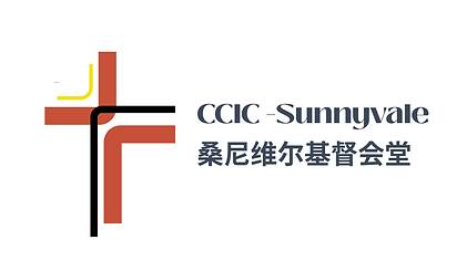
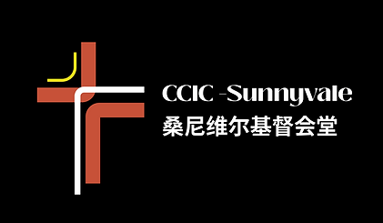
This logo was thoughtfully designed for both light and dark modes, featuring three symbolic elements:
-
Yellow light symbolizes Jesus as the light of the world, offering hope and guidance.
-
Black/white represents Jesus' sacrifice on the cross, signifying His suffering for humanity.
-
Red highlights Jesus' blood, symbolizing redemption and salvation.
The design blends the essence of a Christian church with Sunnyvale’s identity, inspired by sunlight. Its modern yet meaningful approach conveys the cross’s significance and the church’s mission.
While I invested significant thought into creating this logo, leadership ultimately chose to move forward with a traditional and conservative design.
Applied Flexible & Adaptable Components


We implemented flexible and adaptable design components on certain pages to improve collaboration and efficiency between developers and designers, allowing for quick updates to church information and content.
Implemented ADA Compliance


Implemented ADA compliance in website design by integrating:
-
Clear, legible fonts and high-contrast colors to enhance readability for users with visual impairments, including elder-friendly font sizes.
-
Structured content with accessible headings and labels to facilitate seamless screen reader navigation.
-
Features such as alt text, a bilingual language toggle, light/dark modes, and focus indicators to ensure an inclusive and accessible user experience.
Enhanced Product Discoverability


-
Clear navigation with collapsible menus or a tab bar for quick access to essential sections.
-
Simplified categories to reduce cognitive load, making overload content more accessible.
-
Streamlined structure to boost engagement and improve conversions in key flows like contact form opening
.
Integrated New Design Trend

Dark Mode
Dark mode enhances readability, reduces eye strain in low-light environments, conserves battery life on OLED screens, and creates a sleek, modern aesthetic while improving accessibility and user comfort.

Bento Box Design
Bento box design improves visual hierarchy and content organization, creating a clean, modular layout that enhances readability, navigation, and user engagement.

Sustainable Design Practice
Avoids unnecessary elements and focuses on what is essential. Focusing only on essentials to create a lighter, faster website with a clean, efficient interface. This approach not only enhances user experience but also reduces maintenance efforts over time.
User Testing
To evaluate my design, I conducted user experience testing with 9 participants recruited via a Google questionnaire. Participants explored the website and provided feedback on:
-
General experience
-
Navigation and usability
-
Design and aesthetics
-
Content and information
-
Functionality and performance
-
Accessibility
One participant completed a live usability testing via Zoom, performing two tasks:
-
Locate Sunday school information.
-
Find the time and address for the Mission Night event.
Task success was measured using:
-
Time on Task
-
Difficulty
-
Likelihood of Use
Key Feedback Insights:
-
Overall satisfaction with the design.
-
Clear, intuitive navigation and organized structure.
-
Visual design needs improvement to better appeal to younger audiences.
-
Content felt slightly overwhelming; suggested streamlining for clarity.
-
Functionality and performance rated as excellent.
IMPACT
Since the redesign, the website has shown significant growth in key performance metrics.

150%
Increase in visits
New Users
Steady increase, showcasing improved discoverability and growing interest.
Event Count
Surge in engagement with features like form submissions, video views, and interactive elements.
Active Users
Notable rise, indicating enhanced content and user experience that retain visitors and encourage continued interaction.
Key Takeaways
Completing the church website redesign taught me valuable lessons in real-world team collaboration. It helped solidify my design skills and deepen my understanding of ADA compliance and accessibility.
In designing for a church, it's crucial to strike a balance between tradition and modernity, aligning the design with the church's mission.
I learned the importance of an iterative design process to refine both design and functionality.
Maintaining the church's brand consistency is essential, and designing with flexibility ensures the website can grow and evolve alongside the church's future needs.
Next Step
In Phase II, the focus will shift towards refining the visual and content design to reinforce the church’s brand identity. This will be achieved through cohesive visuals, a consistent tone, and clear messaging that aligns with the church’s values and mission.

