OVERVIEW
Wander Mobile App: Empowering effortless travel planning
Wander is an AI-powered mobile app, designed to create personalized and customized travel plans tailored to users’ preferences. The target users are young adults aged from 27 to 42, they are called millennia. It was developed in Fall, 2023. My role is full stack designer and illustrations.
Features
-
Smart Recommendation: provided tailored recommendations for destinations, activities and popular journey.
-
Personalized Itinerary Planning: offered smart and customized itinerary solutions based on user's preference, travel history, and interests.
-
Simplify: simplified the trip planning process for users, ensuring a better travel experience.
-
Connecting and Sharing: lets friends collaboratively edit trip plans and share travel photos and stories, creating a social platform for shared experiences.

Design Process

Discover
Competitive Analysis
User Research
User Interview
Define
User Persona
Empathy Map
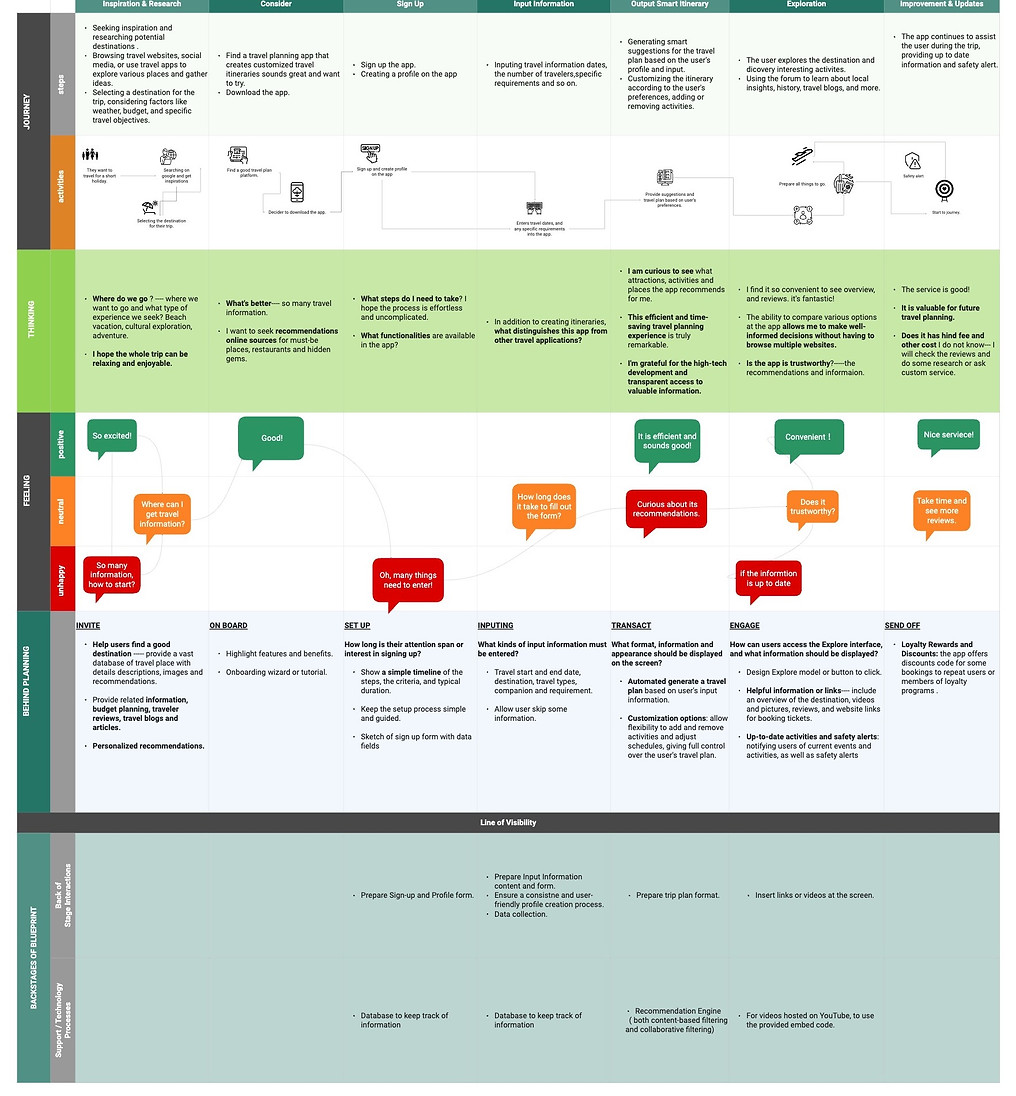
User Journey
Ideate
Brain Storming
User Flow
Information Architiecture
Design
Low-Fi Design
High-Fi Design
Visual Design
Prototyping
Test
Usability Testing
Feedback
Implement
Why did I create the mobile app?
I love traveling, but the stress of researching and booking can be overwhelming, and many of my friends feel the same way. For young adults, especially millennials, planning a trip while managing financial constraints is a common challenge. To simplify this process, I developed a mobile app that generates personalized travel plans with just one click.
Millennials, aged 27 to 42, often struggle to balance work, personal life, and the desire for affordable travel. They value efficiency and user-friendly solutions, making them the ideal target users for this app. I chose this age group because they lead busy lives and prioritize convenient, cost-effective travel options. The app’s design is tailored to meet their need for simplicity and speed.
My Challenges and Constraints
The project requires a 'travel recommender' engine that offers personalized suggestions for destinations, accommodations, and activities based on user preferences, travel history, and GPS data. I've built a framework to generate trip plans from user input, with the main challenge being understanding the system's logic and functionality.
Due to time constraints, reaching a diverse and substantial user sample in our target age group proved challenging. This limitation in sample size and diversity may impact the comprehensiveness of my findings.
DISCOVER
Research Methods and Findings
-
Literature review demonstrates that user-generated content (UGC), such as online travel reviews, is increasingly valuable for the travel industry.
-
The online travel market is projected to reach $1091 billion by 2022. U.S.
-
Travel planning is tough with abundant info, pressuring users to decide on destinations and flights.
-
Leisure travelers typically use 7-8 apps for searching, booking, and travel.


Competitive Analysis
The online travel industry is intensely competitive, featuring giants such as TripAdvisor, Kayak, Costco Travel, and Trip.com. Each platform caters to a specific niche, offering travelers unique solutions, from trusted reviews and comparison tools to exclusive vacation packages and all-in-one travel services.
01
Comprehensive Recommendations
TripAdvisor, a go-to platform for travel reviews, ratings, and recommendations.
03
Exclusive Deals
Kayak platform focus on Meta-search engine for travel deals.
02
Comprehensive Travel Booking
Trip.com provide comprehensive travel booking and services with a global reach, especially strong in Asia.
04
Exclusive Vacation Packages
Costco Travel offers exclusive deals on vacations, hotels, cruises, and rentals for members.
Wander sets itself apart by specializing in personalized travel plans, aiming to be a tailored travel companion—an area often overlooked by competitors.
User Research & Interview
I took Quantitative and Qualitative methods. For the Quantitative aspect, I conducted a questionnaire via email, receiving responses from 6 participants. For the Qualitative portion, I conducted in-person interviews with 2 participants.
Goals:
-
Understand the process and emotions involved in travel planning, including the apps or websites users rely on.
-
Identify common user behaviors and experiences that my product aims to address.
-
Gain insights into user needs and frustrations related to the travel product I'm designing.
Insights:
-
Participants enjoy traveling, taking 2-3 trips per year, typically lasting about a week.
-
They prefer DIY tours for personalized experiences.
-
They dislike travel apps/websites due to impersonality, information overload, and accuracy issues.
-
Participants appreciate visual content and rely on Google and ChatGPT for travel information.
-
They find trip planning challenging due to decision fatigue and choice overload.
-
Users avoid booking on mobile devices due to screen size limitations.
.jpg)
DEFINE & IDEATE
Sketches and Concepts
User Persona
Empathy Map
-
It is concluded that travelers get frustrated with inaccurate or outdated trip information.
-
Comparing prices across multiple travel sites is a major hassle.
-
Limited customization options on travel apps/websites lead to less personalized trip plans.

User Journey

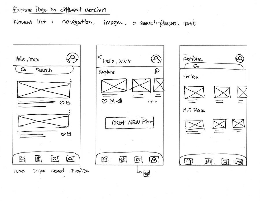
Initial Sketches
Storyboard

User Flow

Information Architecture

DESIGN & TEST
Design Iteration
Low-fidelity Design


User Testing I
During the first round of user testing, I interviewed 4 people to evaluate several key aspects of the app.
I aimed to determine if users could successfully schedule their trip plans, identify areas of confusion, and understand their expectations for a travel planning app.
-
Their feedback highlighted a need for improvements in the app's logic and creativity.
-
They found the landing pages unclear and unintuitive, and interactions felt mechanical.
-
The travel preference survey caused confusion, while the detailed trip plan screen lacked flexibility.
-
Additionally, they felt that an excess of features was detracting from the app’s user-friendly design. Based on their feedback, I made the following adjustments:

Improved clarity and intuitiveness of the landing pages.
Redesigned the landing pages, incorporating clear and concise introductions. When swipe the screen reveals animation effects.
Adopted a more casual and approachable tone in the language.
I adopted a casual and approachable tone to better connect with our target audience. Moving away from formal and technical language made our communication more relatable and engaging. This friendly approach creates more personal and accessible experience that strengthened our connection with users.

Improved the categorization of 'travel preferences'.
To better understand user preferences and build trust in the app's recommendations. Adding colorful elements to the 'Travel Preference' screens enhances the user experience, making interactions more enjoyable.

Enhancing Trip Customization and User Experience.
On the 'Trip Details Plan screen', I expanded the options, allowing users to fully customize their trip by adding, deleting, or swapping elements. I also added 'Recommended Hotels' and 'Estimated Costs' modules for a more comprehensive experience.
User Testing II
During phase II of user testing, I observed a generally smooth user experience. However, based on valuable feedback from testers and insightful suggestions from my advisor, I implemented several key adjustments to further enhance the product's intuitive interaction.
The iterative nature of this process underscores the importance of continuous improvement and user-centered design in product development. Each round of testing and subsequent adjustments brings me closer to an optimal user experience, ensuring that my product not only meets but exceeds user expectations.


I split the 'Create Trip' into two screens aims to achieve a more organized categorization for user-input travel information.
On the first page, users can directly input information, when choosing the duration, a calendar will scroll up, and users can use their finger to swipe up for selection. On the second page, all questions and selectable items are expanded for easier selection, eliminating the need to scroll up. The 'Travel with' feature allows users to invite friends to join their trip, enabling them to collaborate and refine their travel plans together.
Before


After


I carefully curated each section for the travel destination page. I included essential details like opening time, duration, and transportation. I readjusted reviews, recommendations, and travel tips, and enabled users to share their own reviews.
Before


After


Final Design
Landing Pages


Login Pages


Preference Setting


Recommendation


My Trips


Trip Plan


My Account


Design System

Typography Sizes Used:
H1 - Header 1- 64px Bold SF Pro Display
H2 - Header 2- 32px Bold SF Pro Display
H2 - Header 2- 32px SemiBold SF Pro Display
H2 - Header 2- 32px Medium SF Pro Display
H3 - Header 3- 24px Bold SF Pro Display- Button
H3 - Header 3- 24px Semibold
H3 - Header 3- 24px Medium SF Pro Display
Paragraph - 16px Regular SF Pro Display
Caption - 12px Medium SF Pro Display
Caption - 12px Regular SF Pro Display
For the color palette, I chose a warm yellow as the dominant color, paired with analogous shades to create a pleasing, refreshing, and exciting effect. Following the 60-30-10 rule, orange serves as the secondary color, while green is used as an accent.
REFLECTION
A Project Full of Lessons
Working on this project significantly enhanced my UX design skills. I gained a deeper understanding of identifying user pain points and defining a clear, focused scope to create a competitive product. I learned that intuitive navigation and strategic data collection are crucial for delivering personalized recommendations and fostering user trust. Adopting an iterative design approach enabled continuous refinement, while maintaining a user-centered mindset ensured that design decisions aligned with user needs. Regular feedback loops and ongoing user testing played a critical role in optimizing the user experience and achieving project success.
Additionally, I learned how AI-powered recommendation technology operates in Wander. The system personalizes travel suggestions by considering users' initial preferences—such as destination, types of places, and activities—then generates a tailored trip plan based on their travel information. By integrating GPS history and user comments, Wander recommends activities and points of interest that align with each user’s unique travel style.


